By Sophomore Oliver Martinez
Spring is officially here; now we can see some plant growth; snow is melting and going away, and we are entering warmer times. However, there are some downsides to warmer spring weather–like awful allergies. I’ve personally started to feel these allergies, and that makes me like spring less. Still, to celebrate spring’s arrival, I’ve made my rankings from worst to best of the seasons of the year.
4. Autumn/Fall
Autumn is in my opinion very boring and the least eventful time of the year. Plants start to lose their leaves, which not only is really sad to see, it just makes it worse that it’s so windy so the leaves go all over the place. It makes it a pain to clean them up. On top of that, this is that sad time of year when school starts. Another thing I dislike about Autumn, weirdly, is the name. Autumn is such a weird name. I don’t know how to explain it, but it sounds so… artificial. Also, I hear people say they like the colors. I think there is nothing to like about them. Orange and yellow are lame colors. There are many that are far better than that.
3. Spring
Spring was close to going into last place, but I think it’s slightly better than Autumn. My main reason for disliking the season is that during Spring, allergies come around. I swear I haven’t gone a year of my life without getting allergies during Spring. They’re the most annoying thing ever. I hate them so much. I hate going to sleep knowing that I’m going to have to breathe through my mouth. It’s also really annoying to have a stuffy nose and, worst of all, a sore throat. I think that after COVID-19 came around, allergies automatically became three times worse. Now, whenever I wake up with a sore throat, I immediately assume I have COVID-19, and it’s really annoying. One reason why spring isn’t the worst season is because of the rebirth of plants and trees. It’s nice to see bright colors for once. And, it’s nice to see the different flowers that sprout during this season.

2. Winter
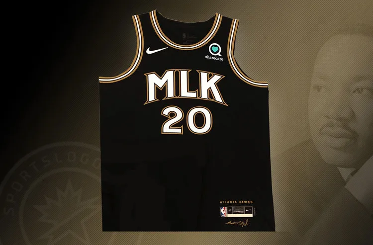
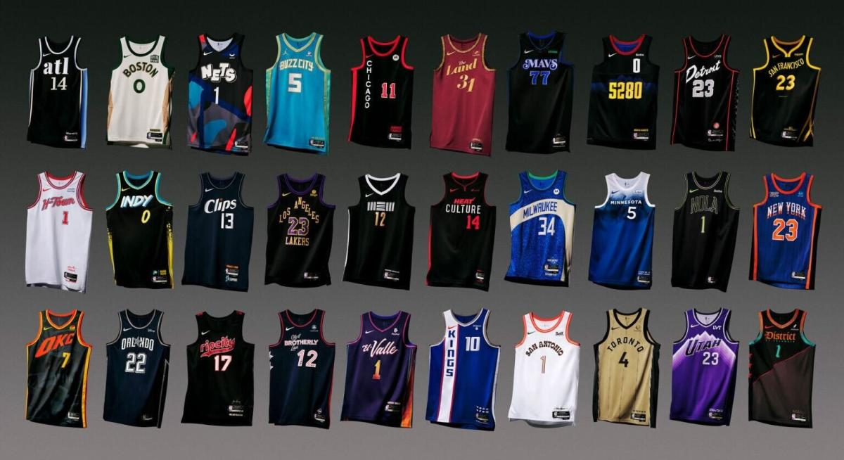
I think Winter is a really good season. I like the cold weather, and I like the overall vibe of this season. I’m not entirely sure why, but people are generally much nicer and happier during Winter. It may be because of holidays, vacations, discounts in shopping, etc. It’s always nice to see people happy. On top of that, winter gives me an excuse to buy more hoodies. Then, since it’s the end of the year, there are a lot of things getting announced for the upcoming year: like movies, games, music, etc. I also like the plans that sports associations have during these times. Like the NBA games during the end of the year are way more fun to watch. They’re a lot more exciting, and teams are releasing limited edition merchandise along with stadium giveaways. And, to top it all off, we get two weeks of break during Christmas and New Year’s which is awesome. Overall, winter is so great because of all the awesome things that are going on at once – the ambience, how people behave, and because of the time we get off from school.

1. Summer
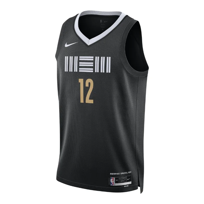
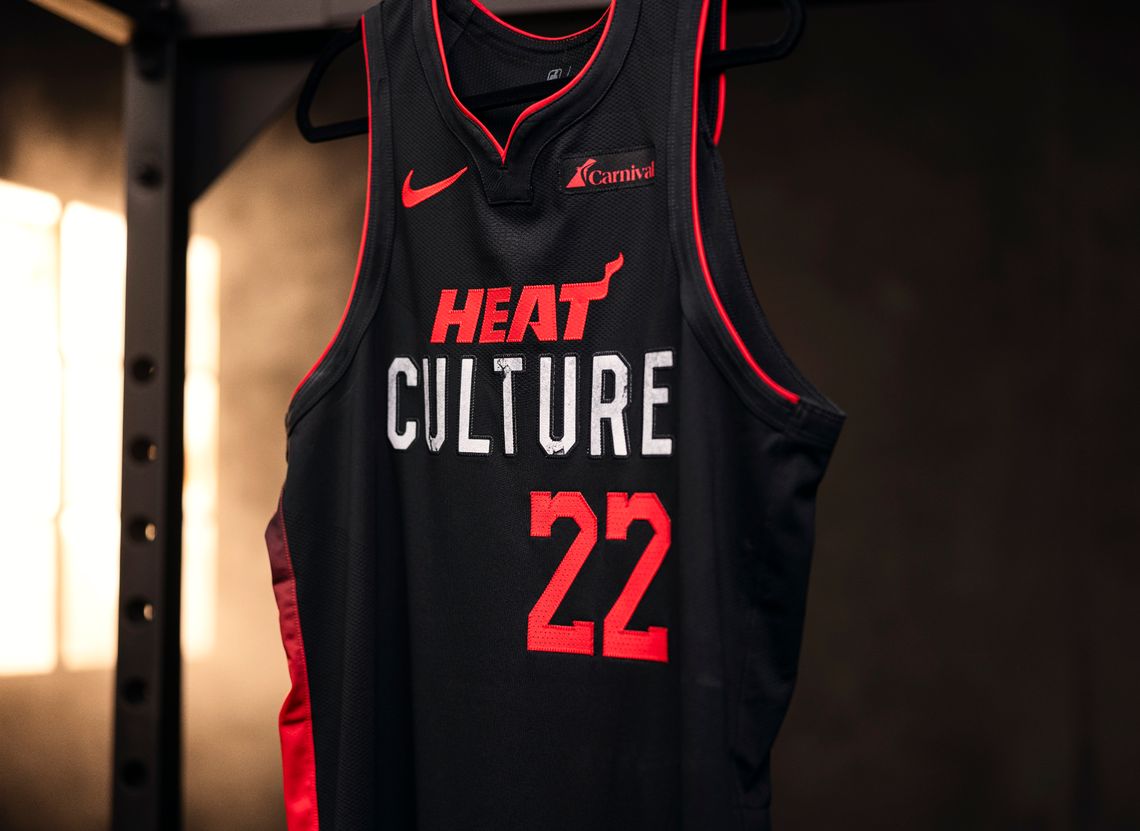
My absolute favorite season of the year is Summer. Although I prefer the colder weather, Summer is just so fun. First of all, we get two months off of school, which is a big plus. I actually don’t mind the heat too much; I know it gets pretty hot, but waking up late and knowing there’s no school for some time is really nice. I have so much free time during summer, I start exploring different things that I thought I would never do. Last summer I read three books, which surprised me because I hadn’t seriously read a book in so long. I like playing basketball at night, and the best part is that all my friends are available to play because there’s no school or homework. I like that I don’t have to go to sleep early because I won’t have to go to school the next day. Allergies are generally not as common during Summer, and (at least for me) getting sick is rare. We also sometimes go on a trip somewhere which is really fun, even if it’s not too far. And, lastly, the NBA playoffs come during summer around mid-late June. It’s so fun watching the games live, and it’s very exciting because all the teams just play so much better during the playoffs. On top of that, it’s fun to find out what team will win the championship. One thing overrated about Summer is going to the beach. I think that going to the beach is overrated and more of an inconvenience because of how dirty you get and how absurdly crowded it is. Overall, Summer is the best season because of vacation off school, the warm weather, the free time, spending time with friends and because of the sports.
I think my list is pretty accurate; maybe it would change once I graduate because there won’t be vacation off school anymore, but for now this is my definitive list of the worst to best seasons of the year. Would you change anything on this list? Let me know in the comments.
*Apparently, the opinions expressed by Oliver Martinez do not express the overall opinions of thebirdonfire.org (especially not Louisa’s).